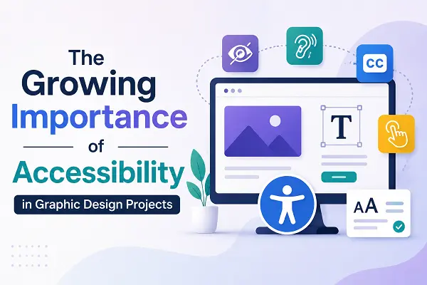
In 2026, inclusive design is no longer a niche requirement—it is a cornerstone of professional graphic design. As digital platforms become the primary gateway for essential services, communication, and commerce, the ability of a design to accommodate all users is a direct reflection of its quality and professionalism. Accessibility ensures that visual content is perceivable, operable, and understandable, regardless of a user’s physical, visual, or cognitive capabilities.
Principles of Universal Visual Communication
Designing for accessibility means building a foundation that supports diversity of experience. By moving away from restrictive layouts and toward inclusive visual strategies, you broaden your audience and improve the overall usability of your content.
-
Color Contrast and Legibility: Text must have a sufficient contrast ratio against the background to be readable for users with low vision or color blindness. Use tools to verify that foreground and background colors meet defined standards, ensuring the message is never obscured.
-
Semantic Typography: Avoid using font sizes that are too small or typefaces with overly stylized letterforms that are difficult to distinguish. Use clear, scalable typography that remains legible across mobile and desktop displays without needing to zoom.
-
Logical Visual Flow: Organize elements to guide the eye in a predictable, linear path. Users relying on assistive screen readers depend on a logical reading order. Avoid cluttered layouts where the path of information is ambiguous or confusing.
-
Beyond Color Signaling: Never rely on color alone to convey meaning, such as using red to indicate an error or green to signal success. Incorporate secondary indicators like distinct icons, text labels, or different patterns so the information is accessible to color-blind users.
-
Alt-Text Strategy: Every visual element—including infographics, illustrations, and photos—should include descriptive alternative text. This allows users with visual impairments to understand the context and purpose of the image through screen-reading software.
Implementing Inclusive Workflows
The most effective way to ensure accessibility is to bake it into the creative process from day one. Integrating these checks early prevents costly redesigns and ensures that your final output is ready for a diverse global audience.
-
Define Accessibility Standards Early: Establish design specs that mandate compliance with established accessibility guidelines. This includes setting default color palettes that are tested for contrast and selecting standard, high-legibility font families.
-
Conduct User-Centric Reviews: Whenever possible, test designs with individuals who have different accessibility needs. Real-world feedback is the most effective way to identify barriers that might be invisible to those without visual or motor impairments.
-
Optimize for Assistive Technology: Ensure that your file exports—whether PDFs, web layouts, or digital assets—are correctly tagged for accessibility. This involves proper document structure, heading levels, and keyboard-navigable interactive elements.
-
Prioritize Clarity in Data Visualization: When designing charts or complex infographics, simplify the information. Use clear keys, labels, and contrasting textures to distinguish data points, ensuring that the visual story is understood by everyone.
The Business and Ethical Impact of Inclusion
Prioritizing accessibility is as much an ethical imperative as it is a strategic business move. When a design is accessible, it is inherently better for all users. High-contrast layouts are easier to read for everyone, not just those with visual impairments; logical, simplified navigation benefits all users regardless of their tech-literacy levels. By removing barriers, you eliminate friction, reduce bounce rates, and demonstrate a commitment to equity that builds long-term brand loyalty. Inclusive design is a key signal of maturity in an agency or designer, proving that they consider the broader human context of their work.
Conclusion
Accessibility is the new standard of design excellence. By proactively addressing the needs of a diverse user base, you create work that is more resilient, intuitive, and effective. In 2026, the best designs are those that welcome the widest possible audience, turning potential barriers into opportunities for clarity and connection. Embracing these practices is not just about compliance; it is about building a more equitable digital future where information and inspiration are available to everyone.
Frequently Asked Questions
Why is accessibility considered a standard of design quality in 2026?
It represents professional maturity. Design is about communication; if a segment of your audience cannot perceive your message, the design has failed its primary purpose. Accessibility ensures your work serves its intended audience without exception.
Does accessible design restrict creative freedom?
Not at all. Designing within accessibility constraints acts as a creative catalyst. It forces you to focus on clarity, hierarchy, and intentionality, which often results in cleaner, more impactful, and more usable visual communication.
What is the most common accessibility mistake in graphic design?
The most common error is relying on color alone to convey meaning—for example, using green and red to distinguish between status updates without adding icons or text. This immediately alienates users with color blindness.
How do I ensure my infographics are accessible?
Provide descriptive text summaries alongside your infographics and use high-contrast textures or shapes to distinguish data points. Ensure that any text within the image is clear and that all images have descriptive alt-text.
Is accessibility only for users with visual impairments?
No. Accessibility also covers cognitive and motor impairments. This includes using simplified language, logical layouts that are easy to navigate with a keyboard, and avoiding flashing content that could trigger photosensitive seizures.