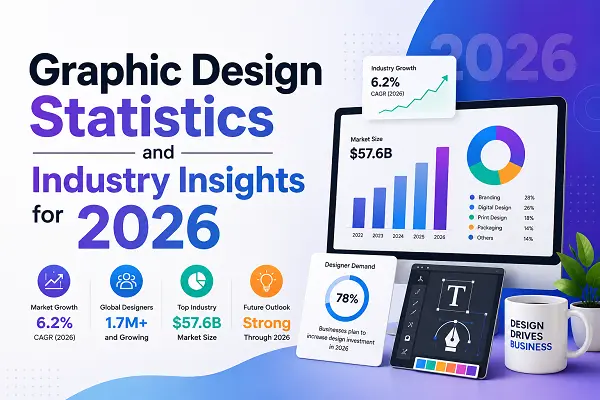
In 2026, social media graphic design has moved beyond simple static imagery. The current landscape demands a fusion of strategic clarity and “imperfect” authenticity. As platforms prioritize content that sparks genuine interaction, your visual assets must serve as intuitive “road signs” that stop the scroll without sacrificing brand integrity. Success today relies on balancing high-impact aesthetics with human-centric storytelling.
Core Principles for High-Performance Graphics
Effective social media design follows a hierarchy where the visual intent is decoded by the brain before the viewer consciously processes the message. To cut through the digital noise, designers must prioritize function alongside form.
-
Radical Simplicity: Treat every graphic like a road sign. Focus on one core emotion, one clear headline, and one primary goal. Excessive text creates “visual noise” that causes users to scroll past your content instantly.
-
Visual Hierarchy: Use size, color contrast, and strategic negative space to guide the eye toward the most important element—usually your primary hook or a call-to-action (CTA).
-
Tactile and Imperfect Aesthetics: The trend of “Imperfect by Design” is defining 2026. Audiences are shifting away from overly polished, sterile, or hyper-perfect imagery. Embracing textures, grain, hand-drawn accents, and “Notes App” style layouts builds trust and feels more relatable.
-
Motion as a Hook: Static images are increasingly being supplemented or replaced by micro-animations. Subtle pulsing text, looping icons, or sliding reveals capture attention more effectively than static layouts, provided the motion is purposeful rather than distracting.
-
Mobile-First Readability: Design for the smallest screen. If your headline or CTA is difficult to read on a phone under bright sunlight, the design fails. Use bold, wide typefaces and ensure high contrast between your background and text.
How to Scale Quality Without Losing Identity
Maintaining brand consistency while producing content at a high velocity is a primary challenge for modern creative teams. The most efficient workflows use a hybrid approach that leverages technology for speed and humans for oversight.
-
Build Modular Templates: Instead of creating every post from scratch, develop a system of components—such as specific header treatments, button styles, and layout grids—that can be recombined. This maintains a unified look across all channels.
-
Define Creative Inputs: Before design begins, ground your assets in clear objectives. Every graphic should ladder up to a specific outcome, whether that is a qualified demo, an employee referral, or brand awareness.
-
Utilize AI for Exploration: Use AI tools to generate multiple layout variations or color palettes based on your established brand rules. This rapid prototyping allows you to test hypotheses—such as product-focused vs. benefit-led designs—before committing to a final master asset.
-
Governance via Documentation: Store your brand rules, approved font pairings, and color palettes in a shared environment. Ensuring that everyone, including automated agents, follows the same guidelines prevents brand drift.
Navigating the “Minimaximalism” Trend
The aesthetic of 2026 is often described as “minimaximalism.” This style combines clean, minimalist layouts with vibrant, attention-grabbing colors. It is the perfect balance for brands that want to be bold without being chaotic.
-
Vibrant Color Strategy: Use bright hues and unexpected gradients strategically to highlight specific features or CTAs. Avoid flooding the entire canvas with color; instead, use it to create focus points that direct the viewer’s gaze.
-
Typography as Storytelling: Experiment with scale and layering. Oversized, bold sans-serif headlines paired with minimal supporting text provide an immediate narrative punch.
-
Inclusive Accessibility: Accessibility is not an optional feature. High contrast ratios, alt-text descriptions, and clear font legibility are essential for ensuring your content reaches the widest possible audience while maintaining professional standards.
Conclusion
Social media design in 2026 is an exercise in intentionality. By blending the efficiency of intelligent automation with the warmth of human-centric, imperfect aesthetics, brands can create visuals that are both professional and deeply authentic. Focus on guiding the user’s eye, respecting the platform context, and delivering a singular, clear message. When you prioritize clarity and genuine emotional connection, your design becomes a powerful engine for engagement.
Frequently Asked Questions
What is “Imperfect by Design” and why is it popular?
It is a shift toward raw, relatable content that values honesty over polish. Users are tired of overly curated feeds; hand-drawn elements, grainy textures, and “lo-fi” aesthetics feel more human and trustworthy.
How do I balance AI-assisted workflows with brand identity?
Use AI to handle repetitive production tasks like resizing or background removal, but keep human oversight for core creative strategy. Define strict brand rules (colors, fonts, voice) that your tools must adhere to.
What are the best design practices for mobile-first content?
Prioritize high contrast, use bold and large typography, and ensure your message is clear within the first three seconds of a scroll. Avoid thin fonts or cluttered layouts that disappear on small screens.
How many fonts should I use in a single graphic?
Stick to a maximum of two: one for the headline and one for support text. Using more than two creates visual clutter and distracts from your primary message.
Does motion always improve engagement?
Only if it is purposeful. Subtle motion—like a pulsing button or a fading headline—guides attention effectively. Flashy or aggressive animations can overwhelm the user and lead to lower engagement.